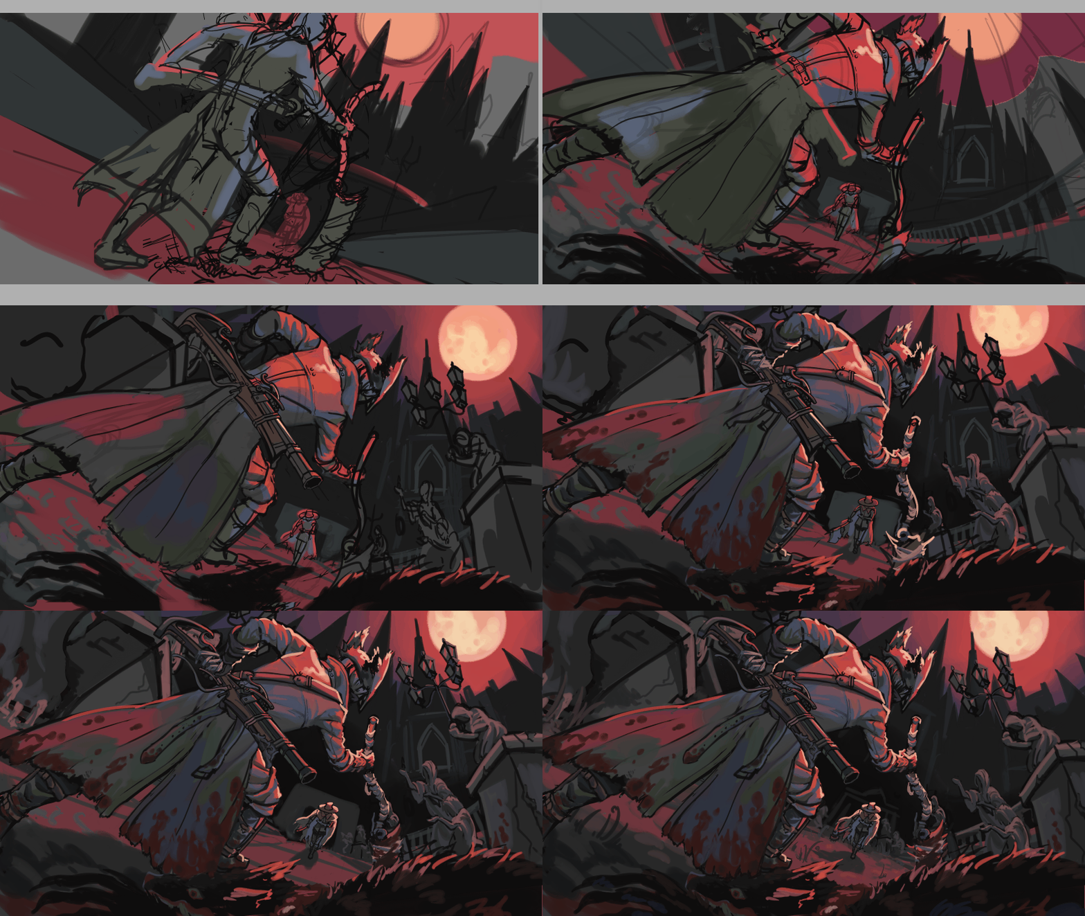
- Initial concept and colours. There was actually an even earlier concept, but the main idea was seeing another hunter framed by the saw cleaver
- Making the pose and composition more dynamic
- Making everything even MORE dynamic, with a fisheye perspective for the background
- Background details, rendering. I made the canvas taller because it felt a bit too cramped
- More rendering, making the lighting more dramatic with highlights.
- More rendering and shading. Highlights to make the main hunter stand out from the background. Changes to the angle of the arm, to make a final composition that brings the eye around the piece in a triangle.
- Little details and shading the other hunter
- Adjustments to the background to make it more consistent with the perspective of the figures
 Back
Back


 Back
Back